Do you know why your presentation is going to fall flat on its face? It’s not because you have horrible presentation skills… it’s actually because you don’t know how to present your ideas in an impactful way.
You can learn the basic presentation skills but if no one is interested in the content or you, there’s no point in getting on stage.
Some people will tell you that it’s easy to present when you have something worth talking about, and this is true to some extent, but in most cases it isn’t the reality.
You see, it’s easy to build a research paper filled with great information or develop a detailed plan filled with insights and strategies. But it is really hard to tell a story through presenting if you do not understand the art of presentations and basic social dynamics.
So how do you give an awesome presentation even if you have a boring topic? Well first off, make sure you have understand what goes into giving a great talk. Once you have that, just avoid these mistakes like the plague:
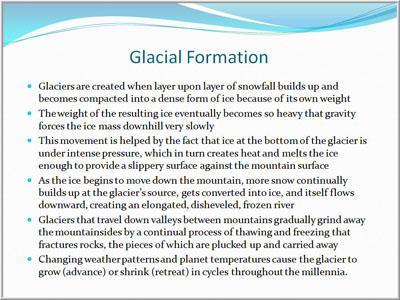
Over populating your slides with text
A lot of professors and bad presentors fill their slides from top to bottom with information. In many cases these presenters get so caught up with the text on their slide that they simply read right from it. In theory, if you have a lot of information, you should put it in front of your audience, but lets be honest. Anyone who is listening to you speak can probably read your slides in their head than you can out loud.
Instead of filling your slides with text, focus on the key message you’re trying to get across and use that on your slide. A good way to improve your slide to text ratio is to simply keep it like a Tweet; 240 characters or less.You can also take a look at Venngage’s presentation maker and choose a pre-designed template to help guide your design. These presentation templates have been designed with engagement in mind already.
Lack of Presentation Prep
Whether you are writing a short speech by hand or putting your deck together in keynote; practicing your presentation is important to the success of it. I don’t know how many times I’ve seen people “wing-it” and completely bomb their presentations or ramble because they didn’t actually time how long their presentation would be.
Before you get on stage to present make sure you’ve put in at LEAST 5x the amount of time it will take to deliver the presentation into building it. When I’m not put into a last minute situation, I usually put at least 15 hours of work into my presentation prep. Not only do I use this time to rehearse my presentation but also to make ongoing adjustments until my story is tight and jokes (when I have them) are worth telling.
But if you’re running late and can’t find the time to prep, there’s a solution. You can use an online text-to-speech tool to complete the verbal part of your presentation for you. Just make sure you don’t use a voice that’s overly robotic or mundane, or you’ll bore your audience.
Tacky Animations & Creative
If I see another presentation with text flying in from the left and photos swirling in from the right; I’m going to start prepping for the apocalypse. When a presentation is delivered with all of these different animation it’s like watching a protein shake in a blender without the top on it. The slides are all over the place.
Slides don’t need fancy transitions to look awesome. Here is a great slide deck that doesn’t include any transitions but still displays professionalism, great creativity and a clear message:
Another reason that presentation is so compelling and captivating is the creators ability to use consistent fonts and colour scheme throughout. By using the same font and colour scheme the readers don’t feel as if the story is out of place or disjointed. It makes the flow consistent and it allows the audience to be captured by YOU and not YOUR SLIDES.
You’re the main character. The slides are simply supporting cast.
Lecturing instead of storytelling
I’m a big believer in storytelling. Whether it’s remarkable storytelling or reactive storytelling; it’s the best way to connect with an audience and to get your points across. Too often do speakers get caught up in highlighting the bells and whistles of their presentation instead of telling an attention worthy story.
When told properly, stories are always more engaging and exciting then a boat load of facts and supporting stats. Now, storytelling isn’t easy. I’ll be the first to say, it’s tough. But that doesn’t give you the right to bore people to death with your presentation. Tell a story that has high-stakes, has a main character, a twist and a conclusion that someone couldn’t guess as soon as you start talking.
Leaving the emotion at the door
If I asked you to think about the most captivating and interesting presentations you’ve ever heard, who would you think of? Maybe Martin Luther King? Steve Jobs? Tom Peters or Seth Godin?
Either way, one thing that each of these great speakers have in common when in front of a crowd is passion. You can’t stand up in front of a crowd and look bored or you’ll bore them just the same. If you can’t get excited as the presenter, how can you expect the audience to be interested in your words?
Unless you’re a celebrity. You cant.
Conclusion
If you avoid the six presentation mistakes above, your presentations are more likely to captivate an audience and be worth talking about. Now when you decide to leverage the above tips, don’t just assume they are going to work for you, make sure you test them out and constantly strive to be better. The art of delivering a powerful and impactful presentation isn’t something that comes overnight. Luckily, you can learn from the many hours I’ve spent presentating and avoid these mistakes.
Remember, when you’re on that stage you have one moment. One opportunity.
What other presentation mistakes should people avoid?


